 Krishna
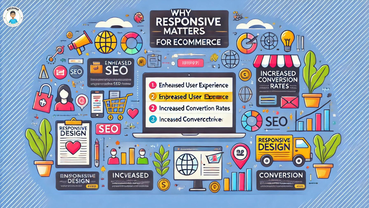
If you’re in the ecommerce business, you know how crucial it is to provide a seamless shopping experience for your customers. One key factor that can make or break this experience is responsive design. But what exactly is responsive design, and why is it so important for ecommerce websites? Let’s dive in and find out.
Case Study: Successful Ecommerce Website Services
What is Responsive Design?
Definition
Responsive design is an approach to web development that ensures a website looks and functions well on all devices, from desktops to tablets to smartphones. It automatically adjusts the layout and elements to fit the screen size and resolution.
Example
Think of it as water taking the shape of whatever container it’s poured into. Your website should adapt to provide an optimal viewing experience, whether it’s accessed on a large desktop monitor or a small smartphone screen.
Benefits of Responsive Design for Ecommerce
Enhanced User Experience
A responsive website ensures that users have a smooth and enjoyable experience, no matter what device they use. This can lead to higher engagement and satisfaction.
- Example: A customer browsing your store on their phone should find it just as easy to navigate and make purchases as someone using a desktop.
Improved SEO Rankings
Search engines like Google prioritize mobile-friendly websites in their search results. Having a responsive design can improve your site’s visibility and ranking.
- Example: Google’s mobile-first indexing means that the mobile version of your website is considered the primary version for ranking purposes.
Increased Conversion Rates
A seamless experience across all devices reduces friction in the buying process, leading to higher conversion rates.
- Example: If a customer can easily browse products and check out on their phone without issues, they are more likely to complete their purchase.
Cost-Effectiveness
Maintaining one responsive site is more cost-effective than managing separate sites for desktop and mobile.
- Example: Instead of spending resources on developing and updating two different sites, you can focus on optimizing one responsive site.
Key Elements of Responsive Design
Flexible Layouts
Using flexible grids and layouts that adjust to different screen sizes ensures that your content is always presented optimally.
- Example: A grid layout that adapts from four columns on a desktop to two columns on a tablet and one column on a smartphone.
Responsive Images
Images that scale and adjust to fit different screen sizes without losing quality are crucial for maintaining visual appeal.
- Example: Implementing CSS techniques like max-width: 100% to ensure images resize correctly.
Media Queries
CSS media queries allow you to apply different styles based on the device’s characteristics, such as screen width and resolution.
- Example: Using media queries to adjust font sizes, spacing, and layout for different devices.
Touch-Friendly Navigation
Ensuring that buttons and links are easily tappable on touchscreens enhances the mobile user experience.
- Example: Larger buttons and increased spacing to prevent users from accidentally tapping the wrong link.
How to Implement Responsive Design
Start with a Mobile-First Approach
Design your website with mobile users in mind first, then scale up for larger screens. This ensures a solid foundation for mobile responsiveness.
- Example: Prioritizing essential content and functionality for the smallest screens first.
Use Responsive Frameworks
Leverage responsive design frameworks like Bootstrap or Foundation to streamline the development process.
- Example: These frameworks come with pre-built responsive components and grid systems, saving you time and effort.
Test Across Devices
Regularly test your website on various devices and screen sizes to ensure it looks and functions as intended.
- Example: Tools like BrowserStack allow you to test your site across multiple devices and browsers.
Conclusion: Embrace Responsive Design for Ecommerce Success
In today’s digital age, responsive design is not just a nice-to-have; it’s essential for ecommerce success. By ensuring your website is accessible and user-friendly on all devices, you can improve user experience, boost SEO rankings, increase conversion rates, and save on development costs. Start implementing responsive design today and see the difference it makes for your ecommerce business.214us

