Ready to Make Your Web Page Look Amazing?
Welcome back! You’ve been doing an incredible job so far, learning HTML and getting started with CSS. Today, we’re going to take things a step further by diving deeper into CSS and learning how to really make your web page pop. Think of it as adding the finishing touches to a painting—small details that make a big difference.
Why Does Styling Matter?
Before we get into the nuts and bolts, let’s talk about why styling is so important. Imagine you walk into a store with great products but the place is a mess—clothes are everywhere, there’s no organization, and the colors clash. You’d probably leave pretty quickly, right? The same goes for websites. Good styling makes a website not just look good, but also easy to navigate and enjoyable to use. It’s all about creating a pleasant experience for your visitors.
Let’s Make Your Web Page Shine
You’ve already got the basics down—your HTML is the structure, like the bones of your website. Now, let’s add some style to those bones, so your site looks as good as it works. We’re going to focus on a few key areas: text styling, spacing, and overall layout. These simple techniques can make a huge difference.
Here’s what your HTML might look like right now:
<!DOCTYPE html>
<html>
<head>
    <title>About Me</title>
    <link rel="stylesheet" href="styles.css">
</head>
<body>
    <h1>Welcome to My Web Page</h1>
    <p>Hi there! My name is Krishna, and I'm learning web design. Below are a few things about me.</p>

    <h2>My Favorite Hobbies</h2>
    <ul>
        <li>Reading</li>
        <li>Coding</li>
        <li>Traveling</li>
    </ul>

    <h2>Here’s a Picture of Me</h2>
    <img src="https://example.com/myphoto.jpg" alt="A picture of me">

    <p>I'm excited to learn more and build amazing websites!</p>
</body>
</html>
Now, let’s add some CSS magic.
Here’s what you could add to your styles.css file:
body {
    background-color: #f9f9f9;
    font-family: 'Verdana', sans-serif;
    margin: 20px;
    color: #333;
}

h1 {
    color: #4a90e2;
    text-align: center;
    font-size: 2.5em;
}

h2 {
    color: #34495e;
    font-size: 1.8em;
    border-bottom: 2px solid #4a90e2;
    padding-bottom: 5px;
    margin-top: 30px;
}

p {
    font-size: 1.1em;
    line-height: 1.8;
    max-width: 600px;
    margin: 10px auto;
    text-align: justify;
}

ul {
    list-style-type: disc;
    color: #16a085;
    margin-left: 40px;
}

img {
    display: block;
    margin: 20px auto;
    border-radius: 10px;
    width: 200px;
    box-shadow: 0 4px 8px rgba(0, 0, 0, 0.1);
}
Breaking Down the Changes
body: We gave the entire page a light gray background and set the text to a clean, readable font (Verdana). Adding some margin around the edges gives the page a bit of breathing room, making it look neat and organized.h1: We made the main heading a bold blue, centered it, and increased the font size to make it stand out as the title of your page.h2: For the subheadings, we used a darker blue-gray color, added a stylish border underneath, and spaced them out to give the page a nice flow.p: The paragraphs got a bit of a makeover too. We increased the font size slightly for better readability, adjusted the line spacing, and centered the text block to make it look professional and easy to read.ul: The list is now styled with custom bullet points and some added margin to separate it from the rest of the text.img: We centered the image, added rounded corners, and applied a soft shadow to give it a polished look. The small touches, like the shadow, make your page look thoughtfully designed.
Why These Details Matter
These changes might seem small, but they add up to create a web page that feels polished and professional. Think of it like decorating a room—choosing the right colors, arranging furniture in a way that feels inviting, and adding those little touches that make it feel like home. Good styling does the same thing for your web page. It makes your content easy to read, visually appealing, and most importantly, it makes visitors want to stay and explore.
See the Transformation
After adding this CSS, save your files and refresh your web page in the browser. You’ll notice how much more cohesive and professional your page looks. It’s amazing how a few lines of CSS can make such a big difference!
What’s Next?
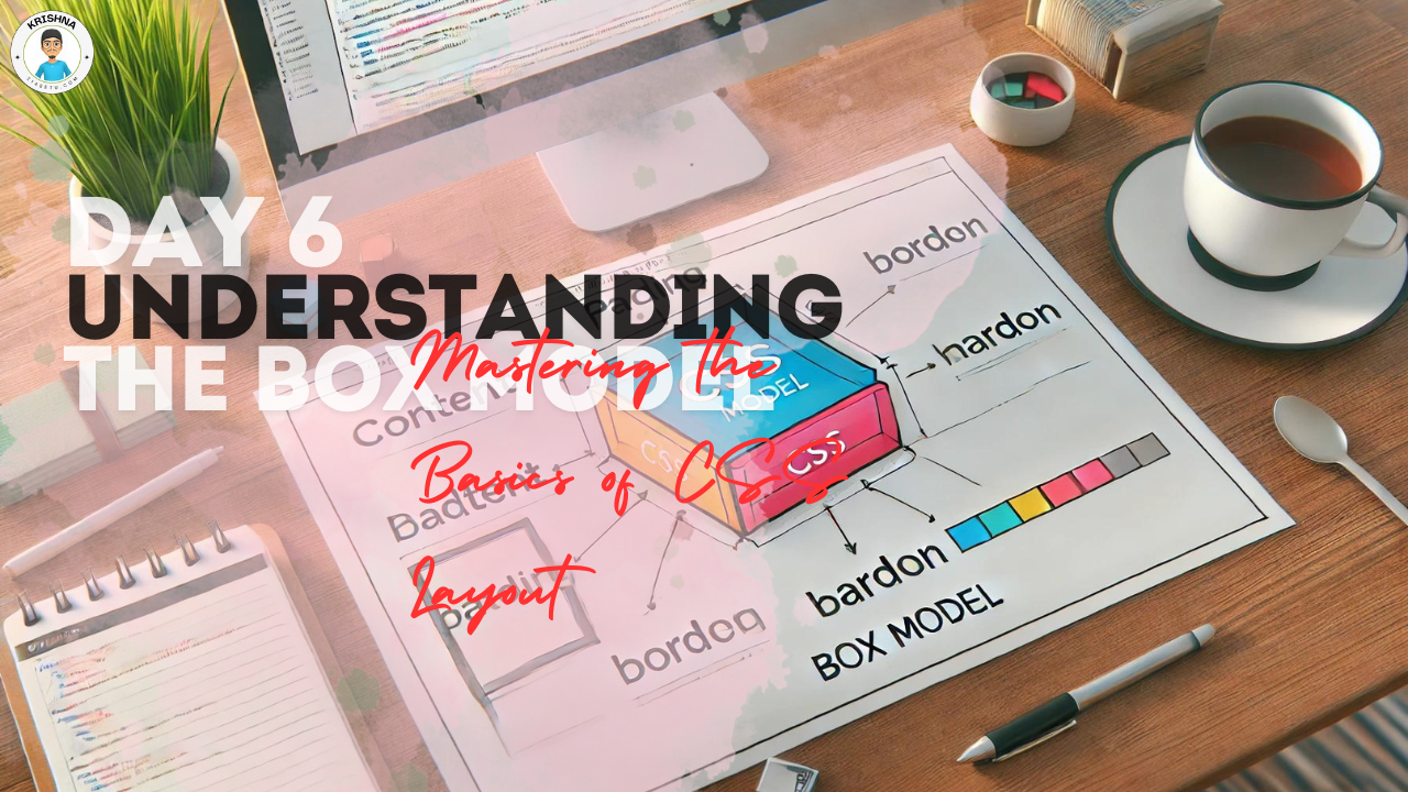
Tomorrow, we’ll explore the powerful tools of the CSS Box Model and Flexbox. These will help you take control of your page layout, making it easier to arrange content in a way that looks great on any screen size.
Final Thoughts:
You’re doing fantastic! Styling with CSS is where web design starts to feel like art. You get to take something plain and functional and turn it into something beautiful and engaging. Keep playing around with different styles and layouts. The more you practice, the more confident you’ll become. You’re on your way to creating something truly special!

