 Krishna
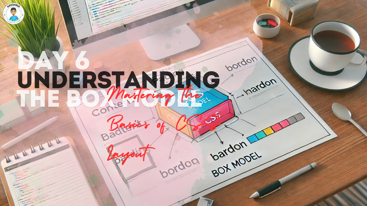
Ready to Dive Deeper into CSS?
Welcome to Day 6 of your web design journey! By now, you’ve learned how to structure your web pages with HTML and style them with CSS. Today, we’re going to explore a fundamental concept in CSS that’s crucial for controlling the layout of your web pages—the Box Model. Don’t worry if it sounds a bit technical; I’m here to break it down in a simple and friendly way.
What is the Box Model?
The Box Model is a core concept in CSS that explains how every element on your web page is essentially a box. Understanding this will help you control the spacing, borders, and overall layout of your content.
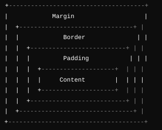
Here’s how the Box Model works:
Imagine each element on your web page (like a paragraph, image, or heading) is wrapped in a box. This box consists of four main parts:
- Content: This is the actual content inside the element, like the text or image.
- Padding: The space between the content and the border. Think of it as the cushioning inside the box.
- Border: The edge or outline of the box. You can think of it as the box’s frame.
- Margin: The space outside the border that separates this box from other boxes.
Here’s a visual to help you imagine it:
Breaking Down the Box Model with CSS
Let’s take a look at how you can control each part of the Box Model using CSS. Here’s a simple example:
div {
    width: 300px;
    padding: 20px;
    border: 5px solid #333;
    margin: 30px;
    background-color: #f0f0f0;
}
Let’s break this down:
width: 300px;: This sets the width of the content area inside the box.padding: 20px;: This adds 20 pixels of space inside the box, between the content and the border.border: 5px solid #333;: This creates a 5-pixel thick solid border around the box, using a dark gray color.margin: 30px;: This adds 30 pixels of space outside the box, separating it from other elements.background-color: #f0f0f0;: This sets the background color of the content area.
Understanding the Total Size of an Element
One important thing to remember about the Box Model is that the total size of an element is determined by adding the width, padding, border, and margin together.
For example, using the above CSS:
- Content width: 300px
- Padding: 20px (on both sides, so 40px total)
- Border: 5px (on both sides, so 10px total)
- Total width: 300px + 40px + 10px = 350px
If you include margins, the total space this element occupies on the page would be 350px + the left and right margins.
Using the Box Model in Real Web Pages
Let’s apply this concept to a real example. Suppose you have a simple HTML page:
<!DOCTYPE html>
<html>
<head>
    <title>Box Model Example</title>
    <link rel="stylesheet" href="styles.css">
</head>
<body>
    <div class="box">
        <h2>Understanding the Box Model</h2>
        <p>This is a paragraph inside a box. Notice how the padding, border, and margin create space around the content.</p>
    </div>
</body>
</html>
Now, let’s add some CSS to style the .box class:
.box {
    width: 400px;
    padding: 15px;
    border: 3px solid #007BFF;
    margin: 20px auto;
    background-color: #e9f5ff;
}

h2 {
    color: #0056b3;
}

p {
    color: #333;
    line-height: 1.6;
}
Here’s what this CSS does:
width: 400px;: The content area of the box is 400px wide.padding: 15px;: Adds space inside the box, between the content and the border.border: 3px solid #007BFF;: Adds a 3-pixel thick blue border around the box.margin: 20px auto;: Adds 20px of space outside the box on the top and bottom, and centers the box horizontally.background-color: #e9f5ff;: Sets a light blue background color for the box.
The result is a neat, well-spaced box on your page that demonstrates how the Box Model works.
Why the Box Model Matters
Understanding the Box Model is essential because it’s the foundation of how CSS handles layout and spacing. Once you’re comfortable with this concept, you’ll have much more control over how your web pages look and behave. You’ll be able to create layouts that are clean, professional, and visually appealing.
Practice Makes Perfect
Take some time today to experiment with the Box Model. Try adjusting the padding, border, and margin on different elements and see how it affects the layout. Understanding these relationships will make it easier to create well-structured and visually appealing web pages.
What’s Next?
Tomorrow, we’ll dive into another powerful tool for CSS layout: Flexbox. Flexbox is a game-changer for creating flexible, responsive layouts that look great on all devices.
Final Thoughts:
You’ve just taken a big step in mastering CSS by understanding the Box Model. This concept might seem simple, but it’s incredibly powerful when you start building more complex layouts. Keep experimenting, and soon you’ll feel confident in your ability to control every aspect of your web design.